The tiny tweak that buyers clock before they’ve even knocked
You’ve mowed the lawn, cleared the hallway, wrestled the kids’ artwork off the fridge. The estate agent has taken photos, the listing is live, and now you’re in that strange limbo where strangers are quietly judging the place you call home.
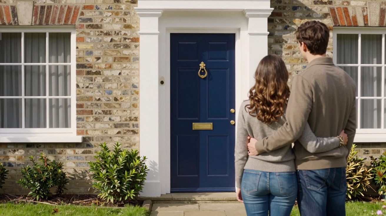
A couple pulls up outside for the first viewing. They haven’t stepped onto the path yet. They haven’t smelled the fresh coffee or seen the new kitchen. What they see first – and what your estate agent knows they’re already reacting to – is your front door.
Scuffed, a bit faded, a colour you chose ten years ago and haven’t thought about since.
When agents talk about an easy, low‑cost change that can nudge offers up by thousands, they almost always start here. And more often than not, they’re talking about one shade in particular: a deep, classic navy blue.
Not bright seaside blue. Not almost‑black. A rich, in‑between navy that quietly whispers, “This house is well cared for and worth a bit more than you think.”
The quiet power of your front door
Estate agents see the same pattern so often it stops feeling like coincidence. Smart, well‑finished front doors get more clicks online, more viewings in person, and slightly bolder opening offers. The rest of the house still has to live up to the promise, of course. But that promise often starts with a square of colour about two metres high.
Here’s why that little rectangle matters more than your perfectly plumped cushions.
Online, your front elevation is usually the first photo on the listing. Scroll‑happy buyers are making snap decisions in seconds: “Looks a bit tired” or “Ooh, that’s nice.” They might not even know why one house feels more “premium” than another at the same price. Your front door is doing more of that work than you think.
In person, kerb appeal softens buyers before they cross the threshold. If the front looks smart and inviting, people walk in expecting to like the house. That makes them more forgiving of small flaws and more open to stretching a little on price. A scruffy or jarring door colour does the opposite: it plants the idea that things have been neglected, even when they haven’t.
Which is why so many agents nudge sellers towards the same, deceptively simple upgrade: repaint it in a deep navy.
Why estate agents love a deep navy front door
Ask three estate agents what colour they’d choose for a front door, and at least two will say some version of “a dark blue – ideally navy”. It isn’t random taste. Navy ticks a handful of boxes that matter in a sale.
First, it looks expensive. Deep navy has that “heritage paint chart” feel – the sort of shade you see on smart London terraces and catalogues for houses far pricier than yours. It suggests quality without feeling showy. Where bright primary blues can look cheap, navy feels tailored.
Second, it flatters almost any style. Navy works with red brick, London stock, white render and modern cladding. It sits happily on Victorian terraces, 1930s semis and brand‑new estates. In estate agent language, it’s “broadly appealing”, which is shorthand for “least likely to put anyone off”.
Third, it photographs beautifully. Estate photography loves contrast. A dark door against lighter walls gives your main listing image a focal point. Navy is deep enough to give that punch, but still shows the panels and mouldings, which get lost if you go full black.
Finally, it feels safe and calm. Blues are associated with trust, stability and cleanliness – not a bad subconscious message when you’re asking someone to trust your plumbing, wiring and roof.
One agent summed it up bluntly: “A navy door makes a £250k house look like a £275k house in the photos. The bricks haven’t changed. People’s perception has.”
What the wrong colour accidentally tells buyers
If navy sends the right signals, the wrong colour can quietly send all the wrong ones.
That sunny yellow door you painted in lockdown? To you it says, “cheerful and creative”. To a buyer skimming listings on a Sunday night, it might say, “That’s another job to budget for.” Neon brights, unusual pastels or very bold statement colours divide opinion. Division is not your friend when you’re chasing the best price.
Faded or peeling paint tells a different story. It suggests that maintenance has slid, even if the boiler is brand new and the roof was done last year. Buyers rarely silo these impressions; if the door looks tired, they wonder what else is.
Then there are colours that accidentally date a property. The high‑gloss pillar‑box red that felt chic in 2010 can now read as “a bit done” in certain areas. Muddy browns and greens can make ex‑council homes and 1970s builds look gloomier than they are.
It’s not that you can’t sell with a purple or terracotta door. You absolutely can. But if you’re aiming to nudge offers up rather than defend them down, a crowd‑pleasing navy is a safer bet.
Think of it as dressing your house for an interview. You’re not erasing its personality; you’re giving it the best chance to be taken seriously.
How to get the “estate agent navy” right
The good news: this is a weekend job that can cost less than a family takeaway and pay for itself many times over in the final price. The difference between a good navy door and a slightly sad one, however, is in the details.
1. Choose the right shade
Look for words like “navy”, “ink”, “midnight” or “rail” on the tin, and avoid anything labelled “royal blue” or “cobalt”. A touch of grey in the mix usually reads more upmarket than pure bright blue.
If your house is:
- Red brick: a slightly smokier navy works beautifully.
- White or cream render: a clean, classic navy pops without clashing.
- Dark brick or cladding: a softer, inky blue stops the entrance disappearing completely.
Buy the smallest tin you can and paint a test patch on card first. Look at it at different times of day; north‑facing doors in particular can make colours appear colder.
2. Pick the right finish
- Satin or eggshell tends to look more expensive and modern.
- High gloss can suit period homes but is less forgiving of lumps and bumps.
Most estate agents lean towards a soft sheen that looks smart in photos but doesn’t scream “brand new paint job”.
3. Do the prep nobody sees
This is the bit future buyers will notice, even if they can’t put their finger on why.
- Clean the door thoroughly.
- Lightly sand any old gloss so the new coat grips.
- Fill deep chips and sand back.
- Use a good primer if you’re going from a very strong colour to navy.
Rushing this stage is how you end up with drips, brush marks and a finish that chips right before the photographer arrives.
4. Upgrade the jewellery
Old, pitted handles and flimsy letterboxes can undo a lot of your hard work. If budget allows, upgrade:
- Handle and lock set
- Letterbox
- Door knocker and numbers
Brass, chrome or matt black all work with navy; just keep everything in the same metal for a deliberate, considered feel. Clean surrounding brickwork or uPVC while you’re there. It all reads as one impression.
If navy really isn’t you: close cousins that still add value
Maybe you can’t stand blue. Maybe your street is already a run of navy doors and you want to stand out – gently. There are a few colours estate agents mention in the same breath as navy when it comes to adding quiet value.
| Colour | What it signals |
|---|---|
| Almost‑black | Luxury, security, drama |
| Deep bottle green | Heritage, character, calm |
| Soft charcoal grey | Modern, low‑maintenance |
All three share navy’s strengths: they’re deep, sophisticated, broadly appealing and easy to live with. They also tend to work across different house types and brick colours.
What most agents gently steer sellers away from when chasing the best possible price:
- Very bright primary colours
- Pastel pinks, lilacs and mint greens
- Strong oranges and yellows
- Anything that’s clearly theme‑y (club colours, novelty designs)
Those may win you likes on Instagram, but they can lose you viewers in real life.
A cheap weekend job that can add thousands
Will a tin of navy paint magically add £10,000 to every home? No. Location, layout, condition and market all matter more. But when those big pieces are fixed, presentation is often where the extra £3,000–£5,000 lives – the space between “we’ll think about it” and “let’s just go for it”.
Freshening your front door in a smart, estate‑agent‑approved colour:
- Costs relatively little compared with new kitchens or bathrooms.
- Photographs incredibly well for online listings.
- Signals care, quality and “move‑in ready” from the very first glance.
- Reduces the list of “we’ll have to change that” in a buyer’s head – which often gets translated into lower offers.
And unlike most home improvements, you can do it in a single weekend without a tradesperson, dust sheets in every room or a blown budget.
On the morning of your next viewing, when the agent is fiddling with the keys and the buyers are walking up the path, they’ll see that deep navy door catching the light and think, “This looks promising.”
By the time they’ve stepped over the threshold, your house is already one quiet step closer to the price you’re hoping for.
FAQ:
- Does it have to be navy to impress buyers? No, but estate agents consistently see the best reactions to deep, classic shades like navy, charcoal, almost‑black and bottle green. The key is a smart, grown‑up colour that feels widely appealing.
- Should I repaint my door even if I’m not selling yet? If it’s chipped, faded or a very personal colour, it’s worth doing now. You’ll enjoy the upgrade, and your home will be “sale‑ready” if you decide to list suddenly.
- Is a new door better than just repainting? If your current door is secure, in good condition and fits well, paint is usually enough. Replacing the whole door makes sense only if there are security, energy‑efficiency or serious aesthetic issues.
- Do estate agents really think this affects value, or just speed of sale? Mostly, it helps with both. A smart, neutral‑but‑elegant door colour tends to generate more interest, which can mean more competing buyers and, in turn, stronger offers.


Comments
Hi, kam dashur të di çmimin tuaj
Leave a Comment